Layout Sketching / UX Ideation / Landing Page Design
CATEGORY: A local business landing page
OBJECTIVE: To design a landing page for a local hybrid energy distributor.
SOLUTION: I offered using the color scheme that comes from the nature itself, the UX journey starts at the main focal point of lowering the bills, it continues explaining the benefits of the hybrid energy and narrows down the user options based on the state map. The offer is being supported by the guarantee and it's finalized by a simple and effective contact form. I have designed several logo modes and the landing page. I also worked on several concepts for public placement promotion, a shopping bag and the digital signage.
TECH: Adobe Photoshop.

Hybrid Energy, several concepts
I tried several versions to see the client's reaction, and it became clear we were both heading into one direction

Hybrid Energy, The Final Logo
The bold capitalized font face to accent on the brand's solidity and clarity

The Hybrid Energy landing page
The final landing page design

The Hybrid Energy promotion ideas
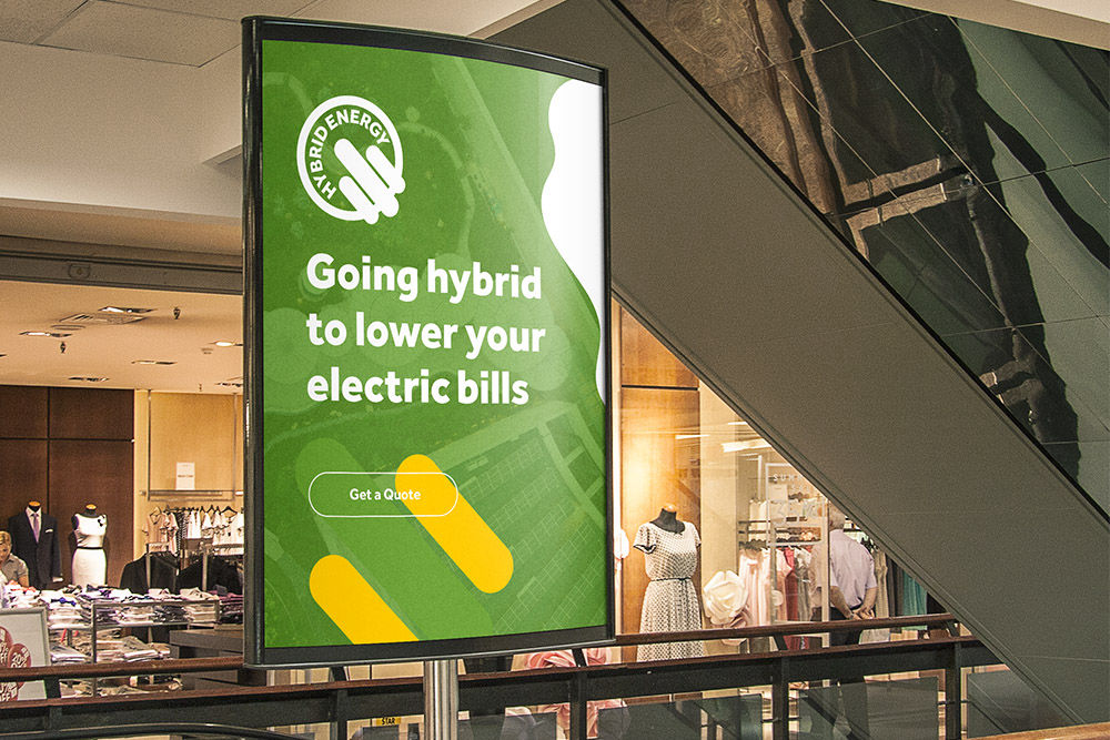
Public area placement

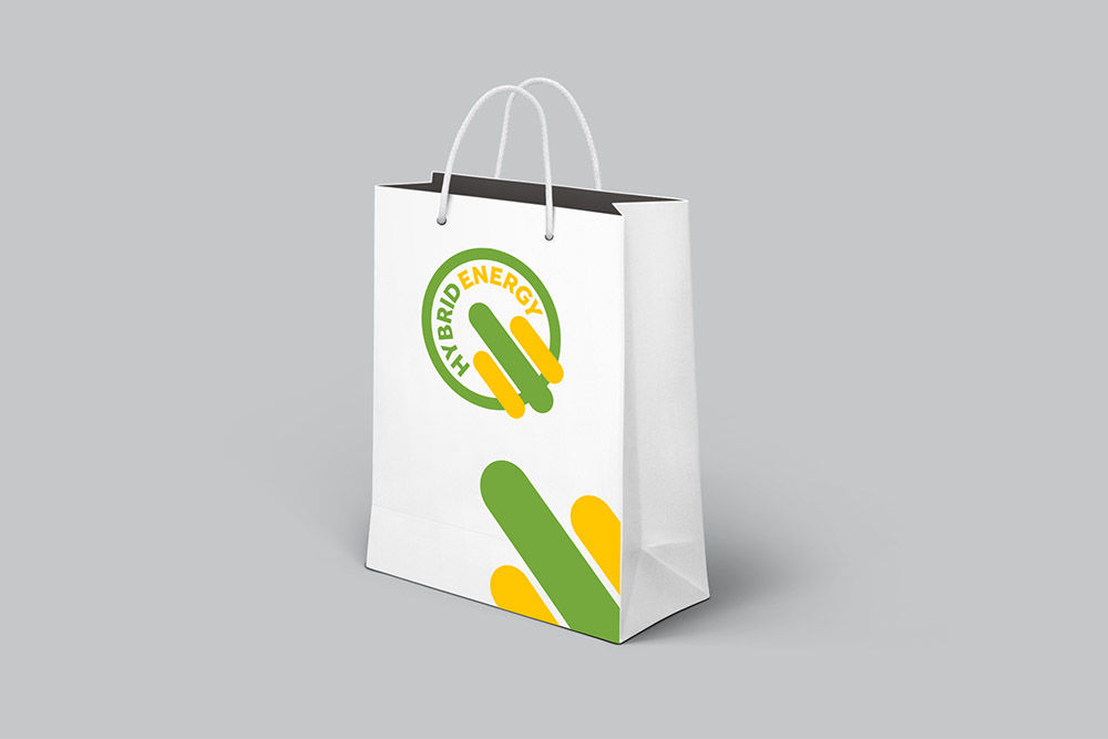
The branded shopping bag
A flashing logo to be seen around in public areas
