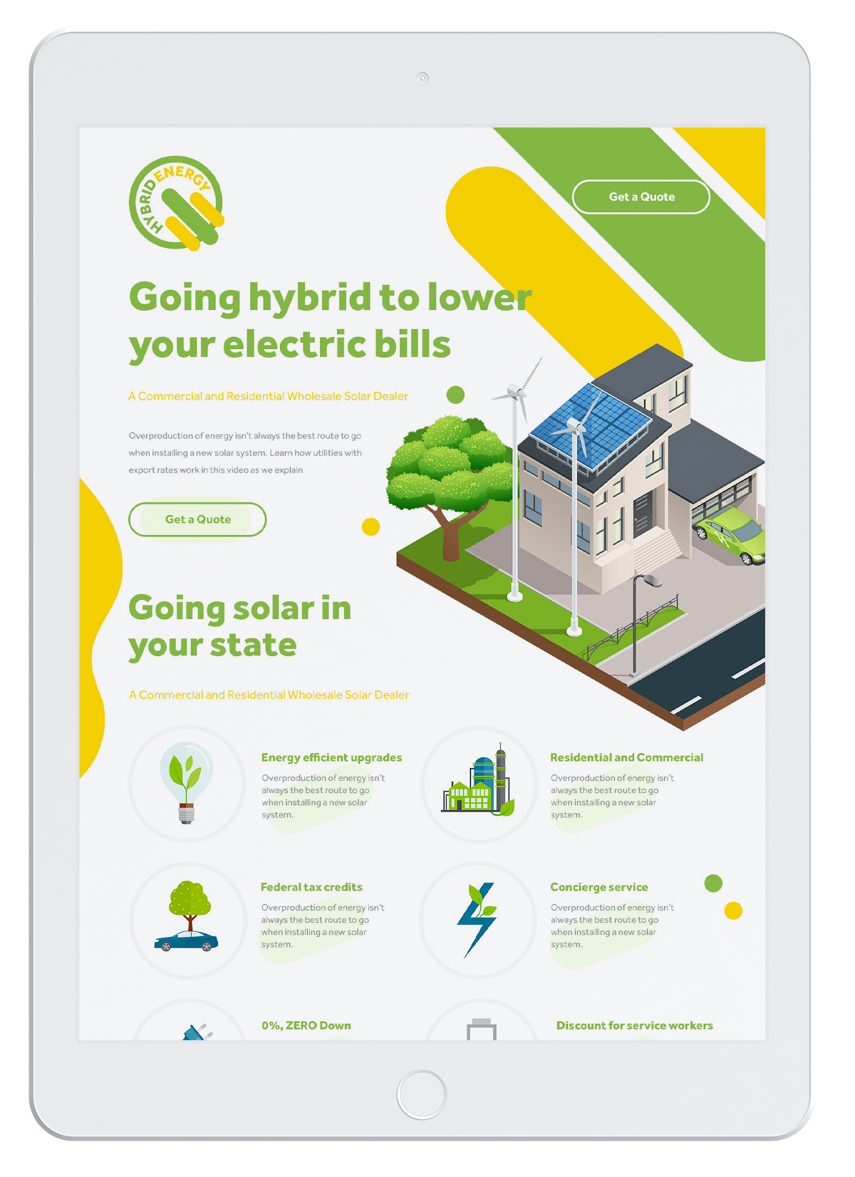
A service provider, specializing in the integration of renewable and traditional energy systems.
Logo Design / Brand Identity Design / Landing Page Design
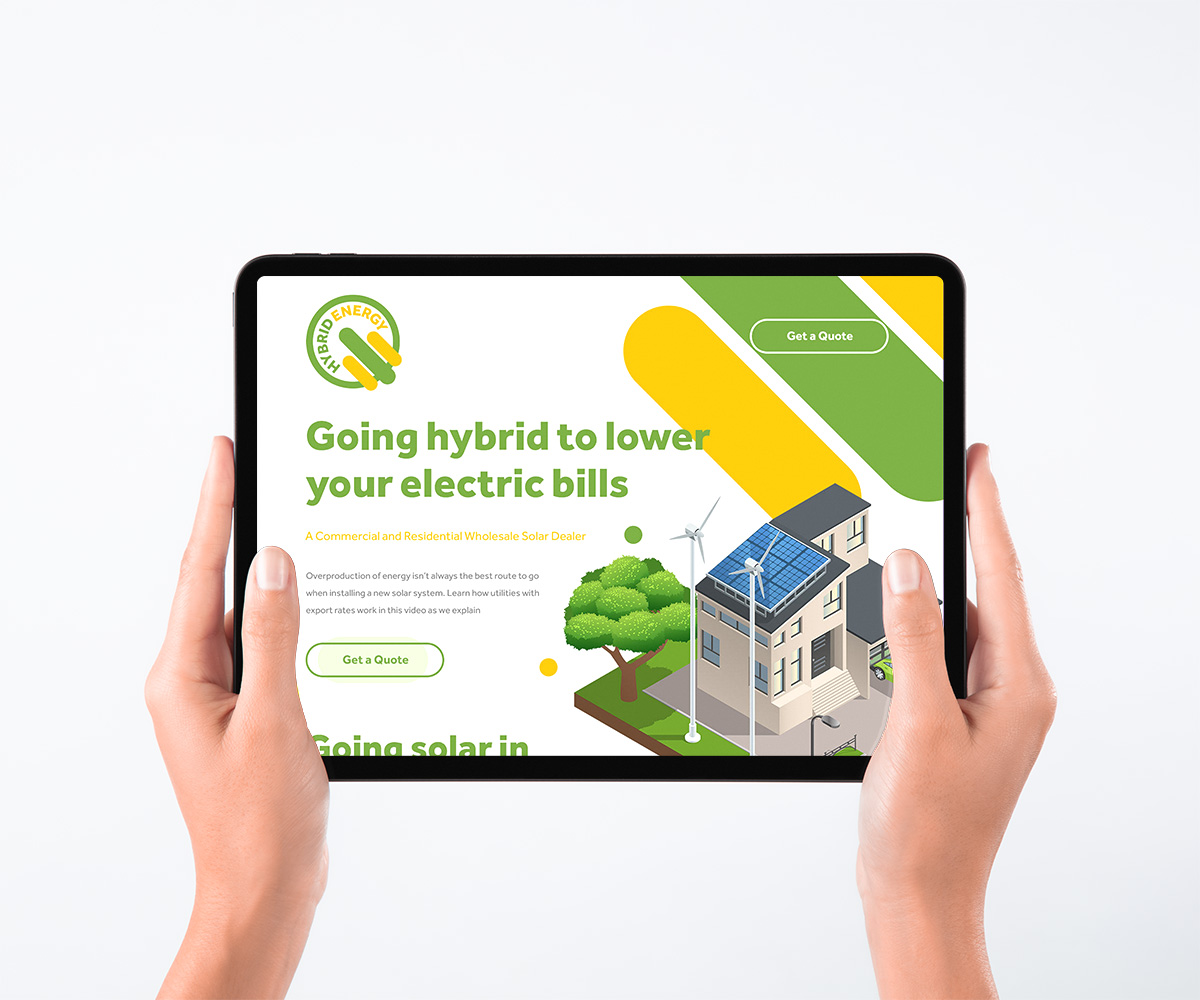
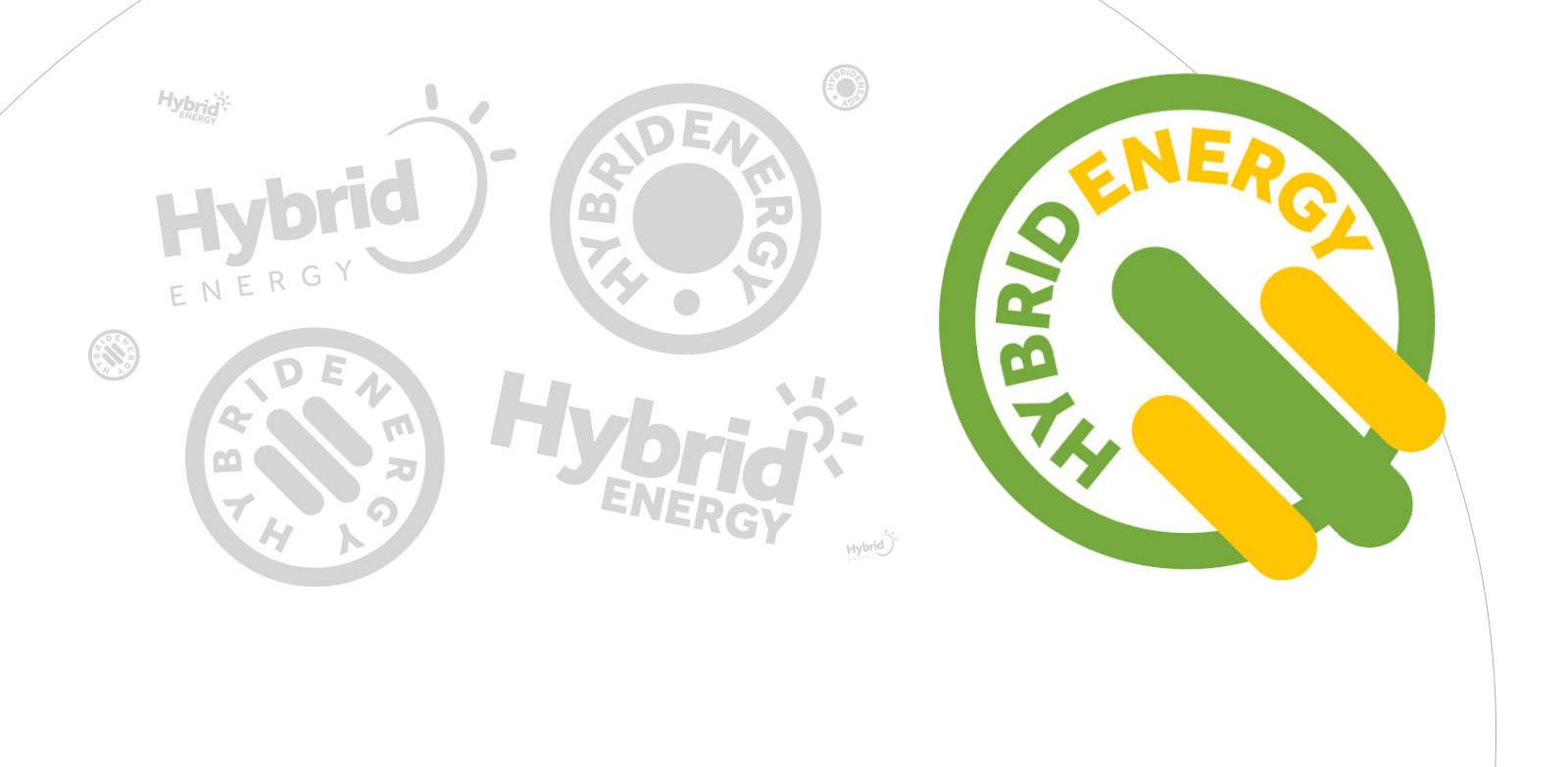
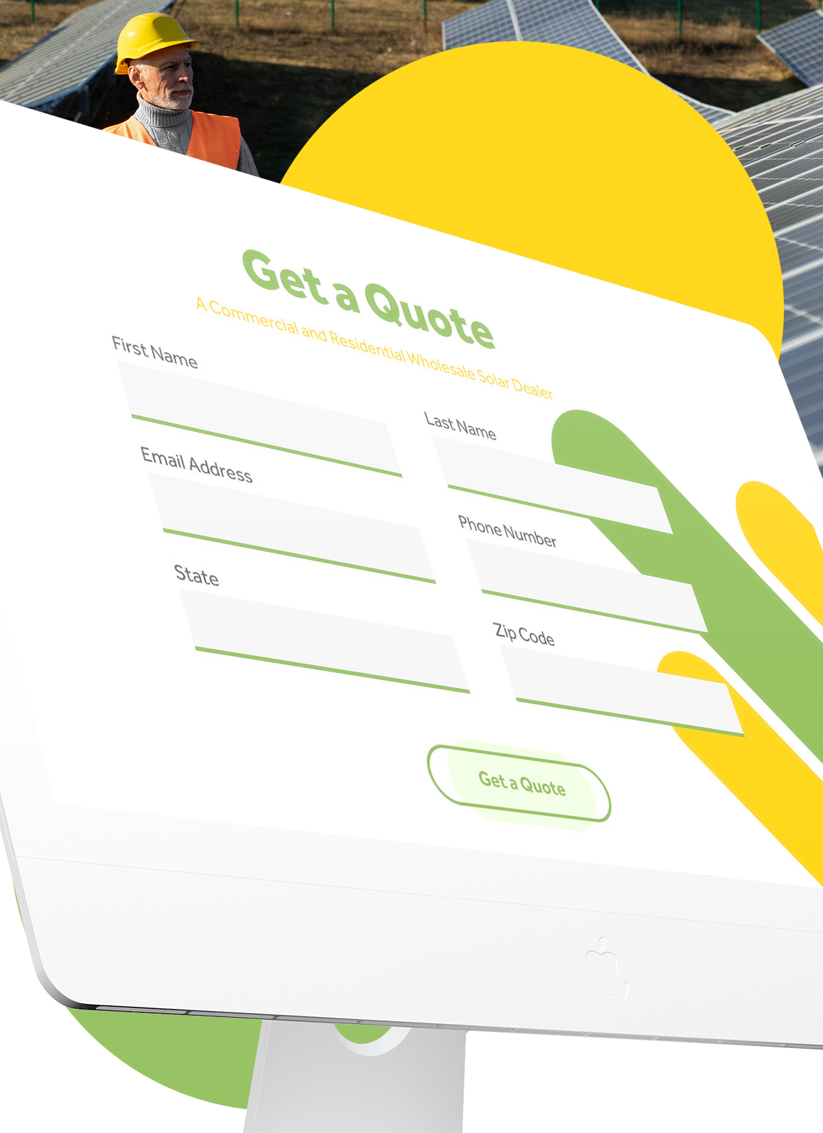
The client needed a site to promote their services. There was literally no direction — just a general idea and an understanding that this type of energy is associated with a green and yellow color scheme. Yellow? Sure — the Sun. The logo? Well, it should be round and have some sort of rays. It needs to hint at bold, modern services. It should feel refreshing.
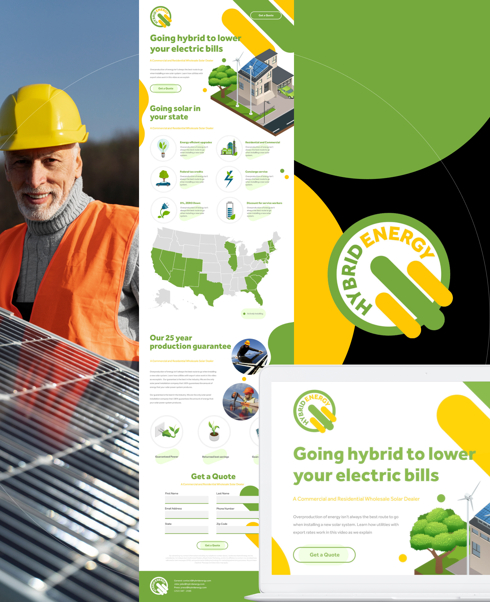
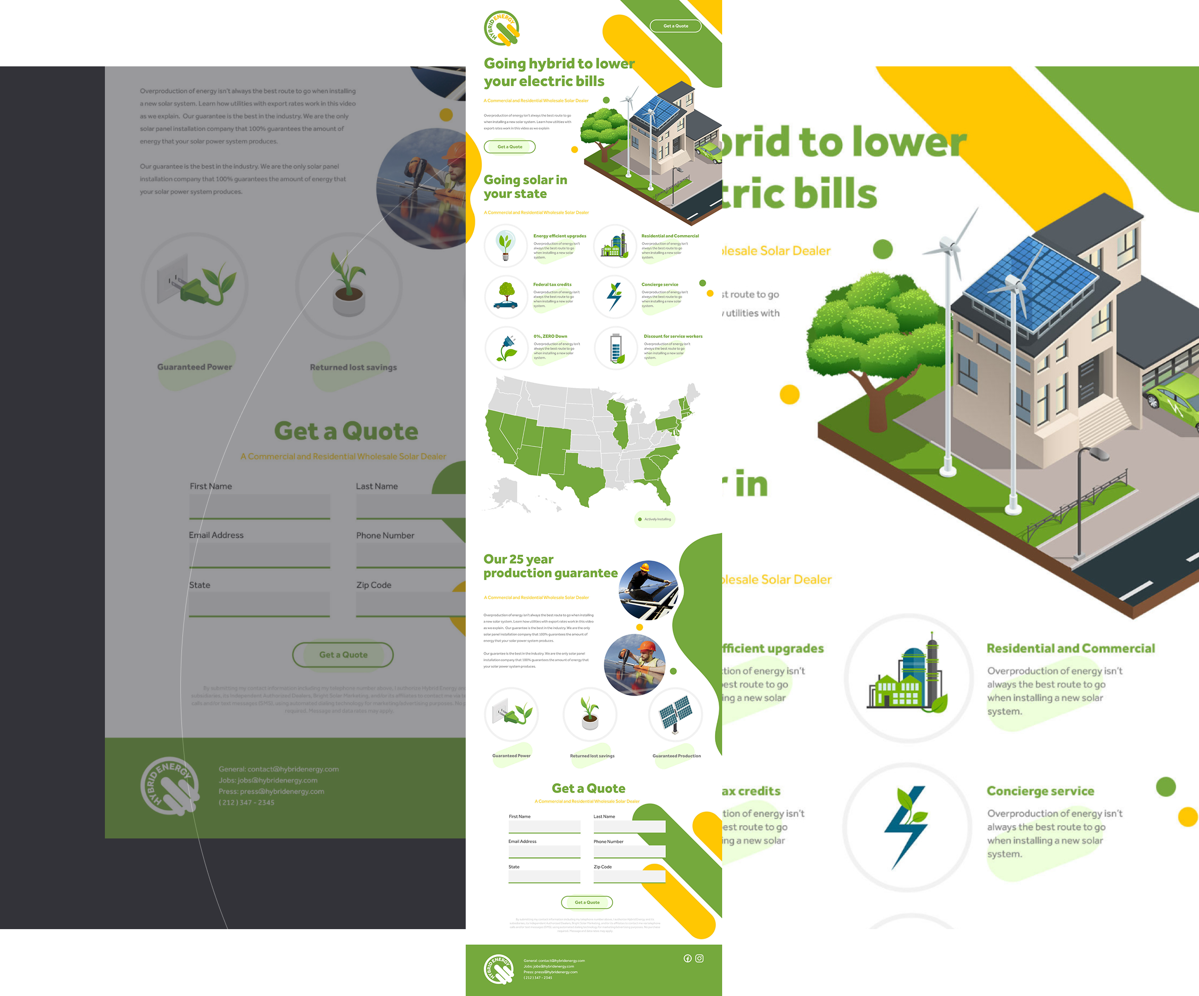
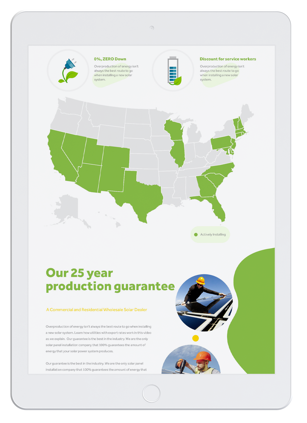
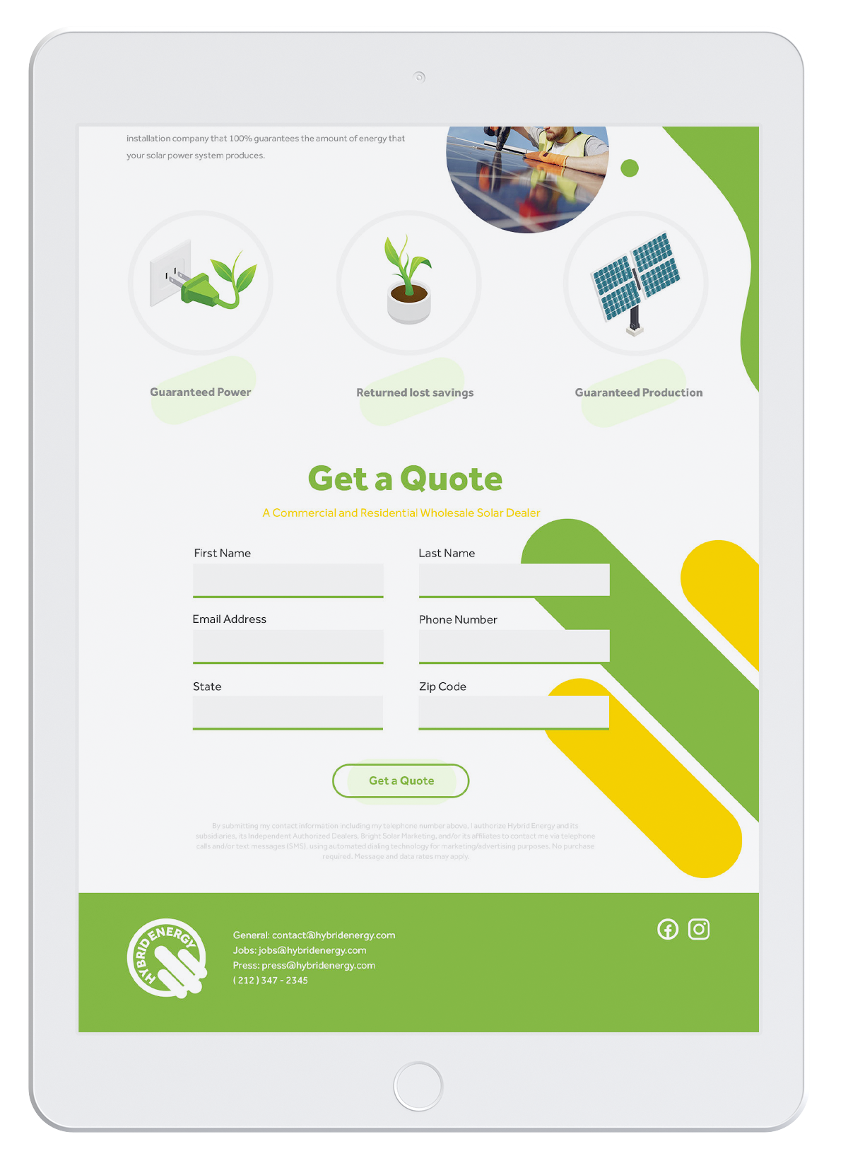
We quickly reviewed the competition, defined the main landing page sections, clarified key sales points, highlighted the nearly nationwide coverage and service guarantee, and set up a form to start collecting client requests right away.
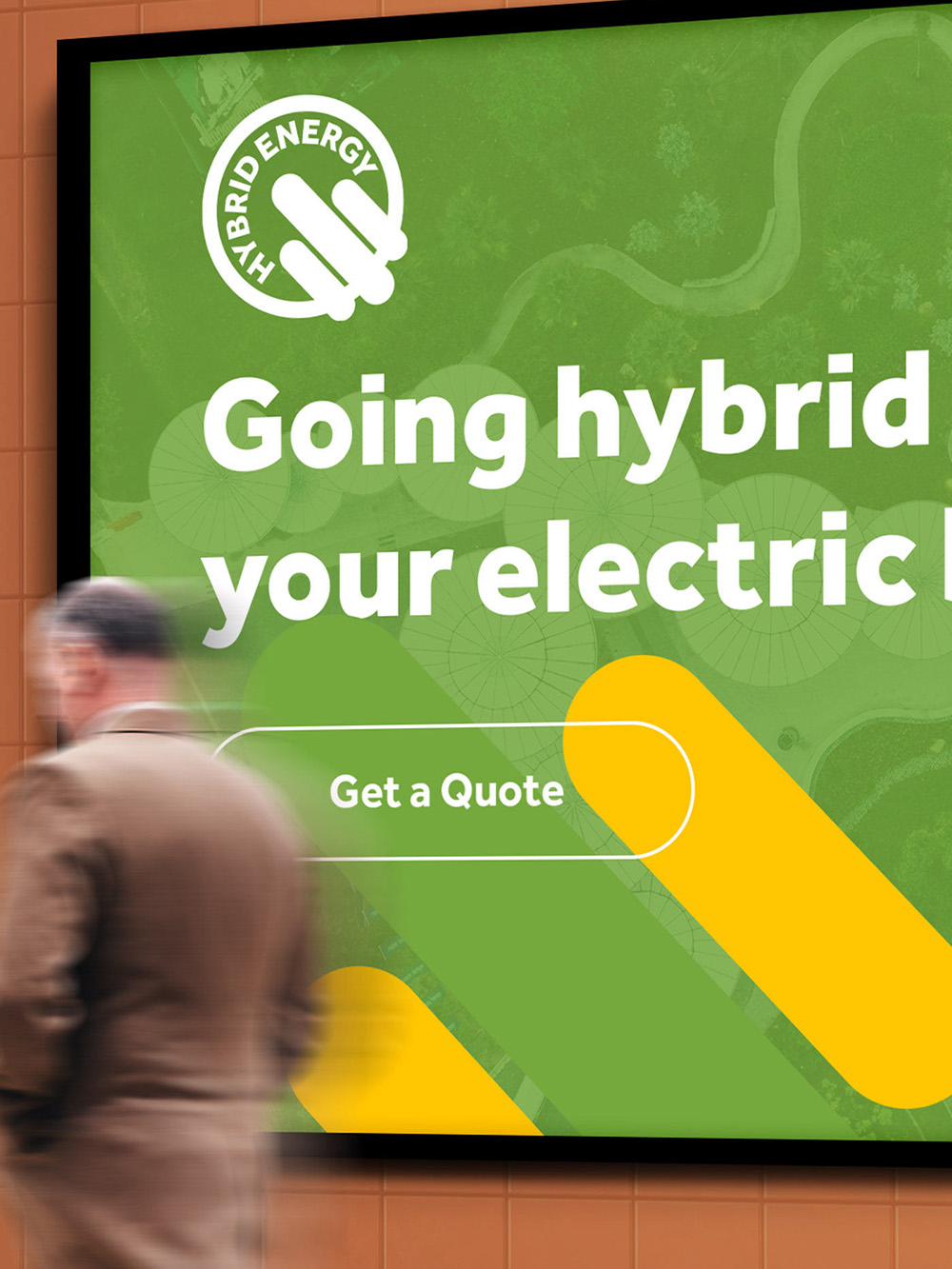
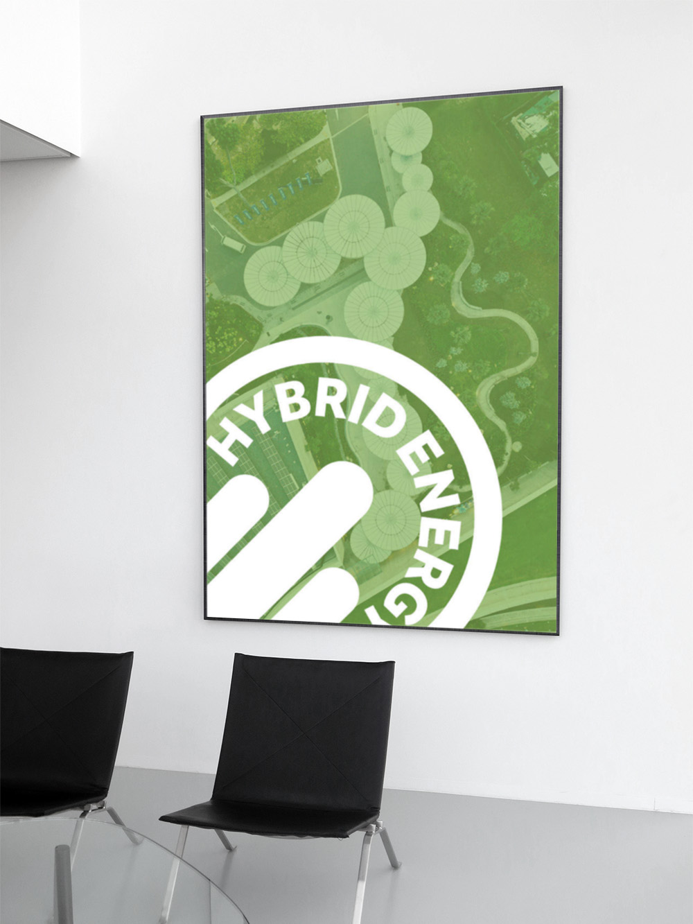
It has to make an impact. It has to be seen. The client needed a bold, visual preview of how their brand would come to life on large-scale outdoor formats — from highway billboards to city banners — it was about commanding attention, turning heads, and making sure the message doesn’t just blend in — it stands out.
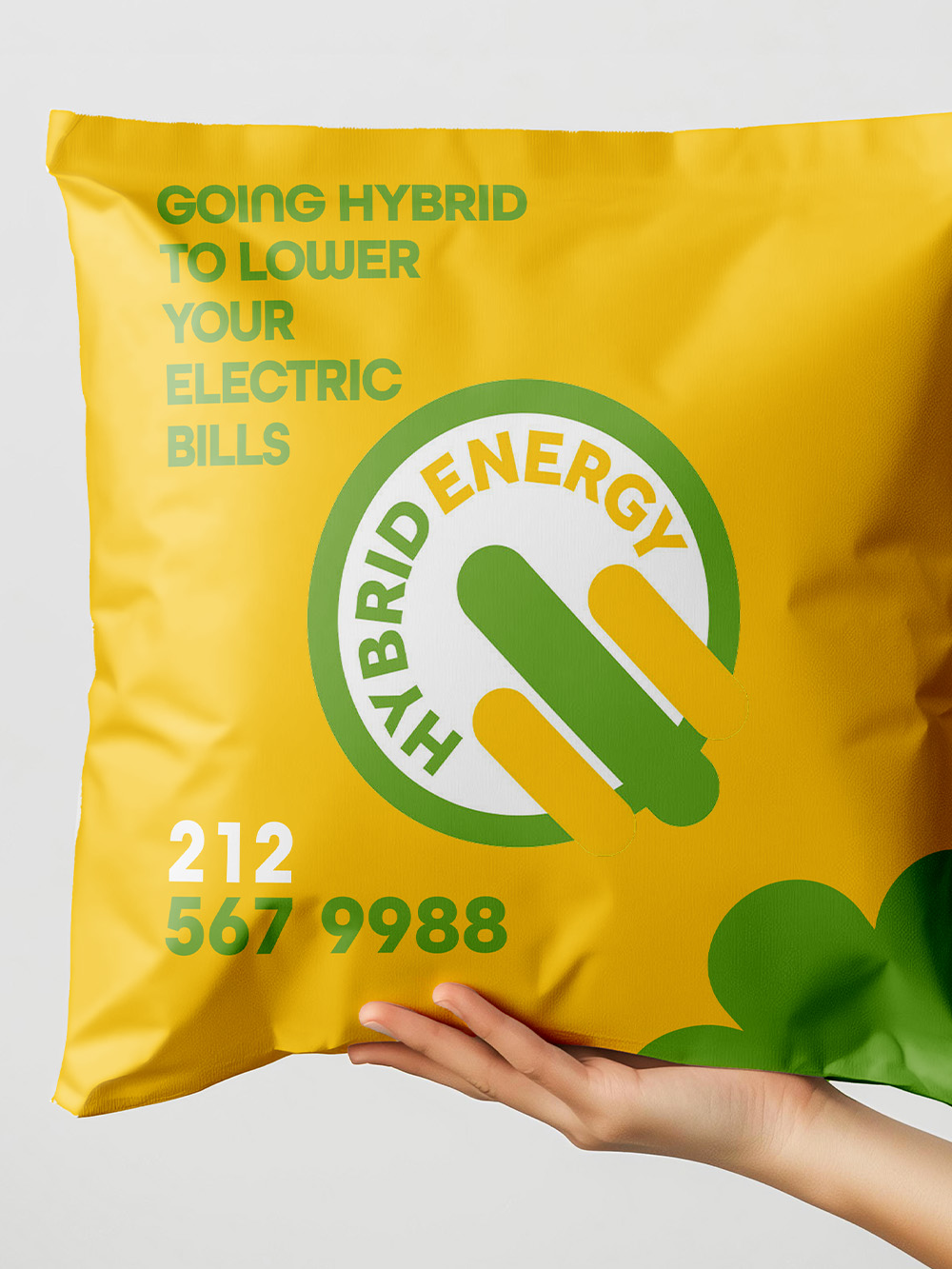
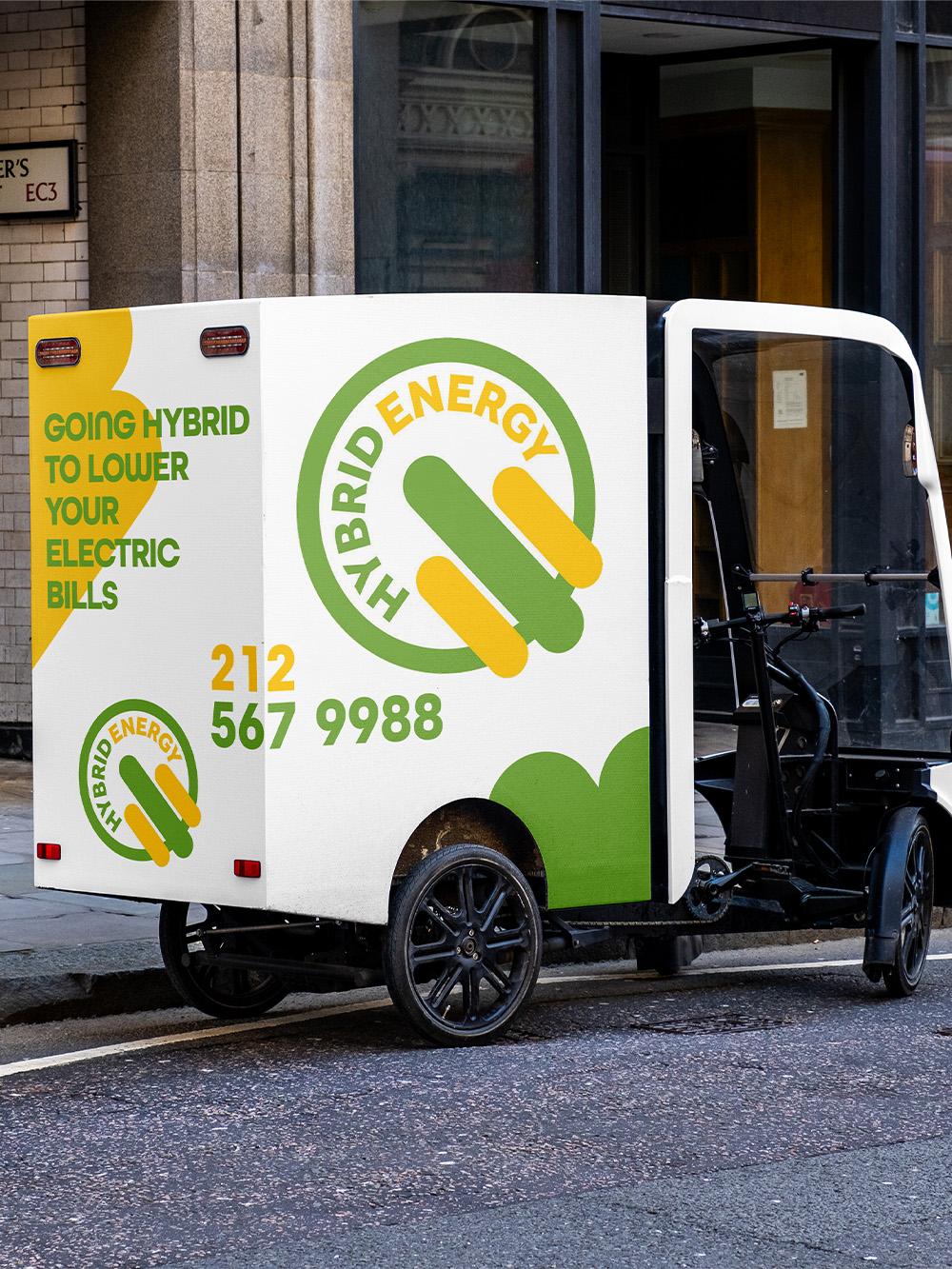
Whatever works—let's explore it. Indoor events too—the more, the better. It has to feel big, even if it's small.