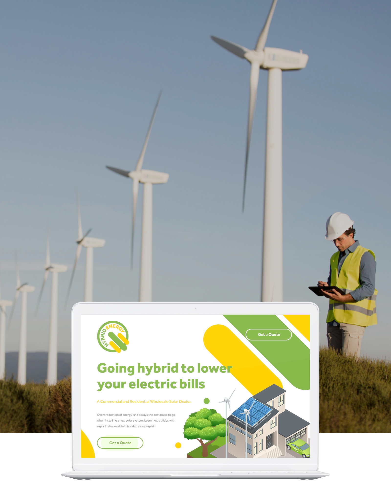
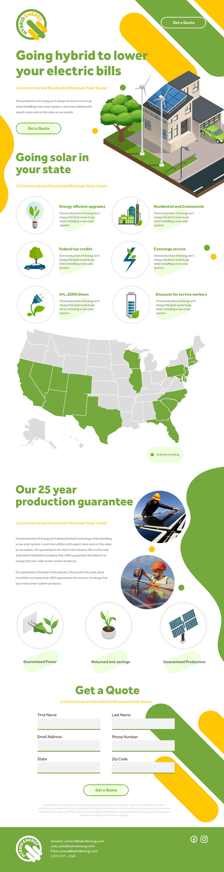
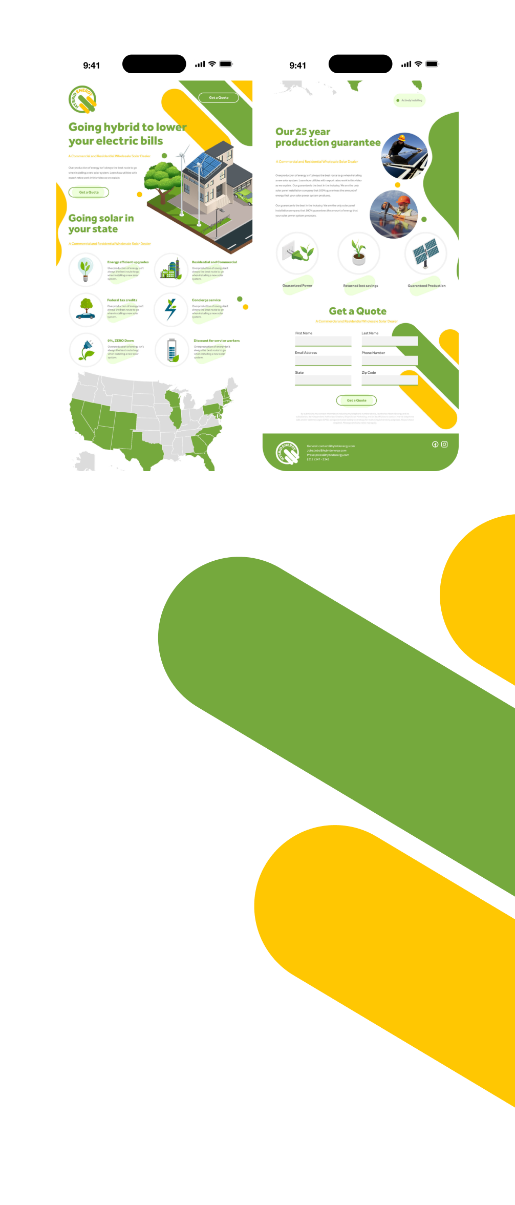
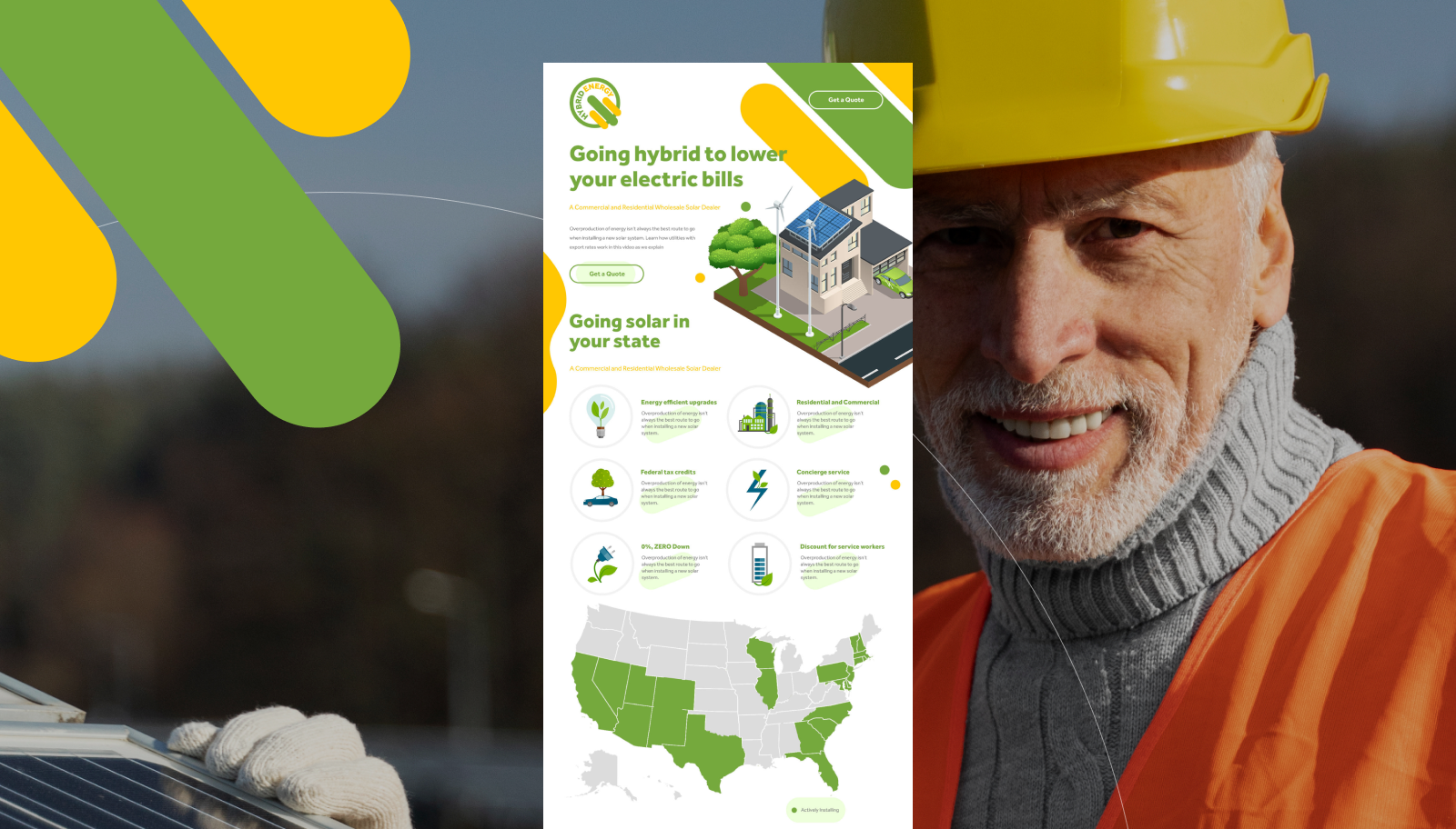
Rehab and outpatient addiction treatment center in Orange County.
I was working with a marketing agency in California at the time. Their client, a rehab facility, had approached them for an obvious reason — they needed more "eyeballs" and "clicks." I was brought into the design process to develop a new vision for their landing page, one that wouldn’t scare potential clients away but would instead highlight the benefits of joining the program. The goal was to revitalize the entire onboarding experience through a design that was both playful and functional.
Yeah. By the time I post this work sample, there will be flying machines everywhere and robots serving us food and medicine. The client—more often than not—needs it fast. It’s not rocket science; it’s about presenting the required information section by section and ending the offer with a bold, clear CTA.
Sure, the button can be red or green—it’ll go through split testing anyway. But at the initial design stage, it’s usually obvious what’s wrong with the current landing page. And I’m fixing it. No wireframes. Sorry.
The client asked for a mobile preview, so I designed and presented both tablet and smartphone versions. Why not mobile-first? Well, I knew I’d be creating a mobile version, but when a client wants a preview—a big impression—I usually start with the desktop design first, then scale it down and simplify it for mobile.